Tuesday, 22 November 2011

I Never Painted K-Mart

Sleepy Time Inn - 28" x 20" - Watercolour 

Sometimes the title is in the painting, but hidden. The Sleepy Time Inn was a motel on the outskirts of Durham NC where you could rent a room for the afternoon. I stayed there once. By the time I painted it the new owners had changed its name to Travel Time Inn. I preferred its first name. The sign retains its original cloud shape and sleepy 'Z'. While I was photographing it from the 'Handy Andy' gas station / convenience store across the road I heard a tornado warning over the car radio hence the big black storm cloud. Ironically when a tornado finally came there was no advance warning. It destroyed K-Mart but left the Travel Time Inn untouched. Perhaps I should have painted K-Mart.
 

Thursday, 3 November 2011

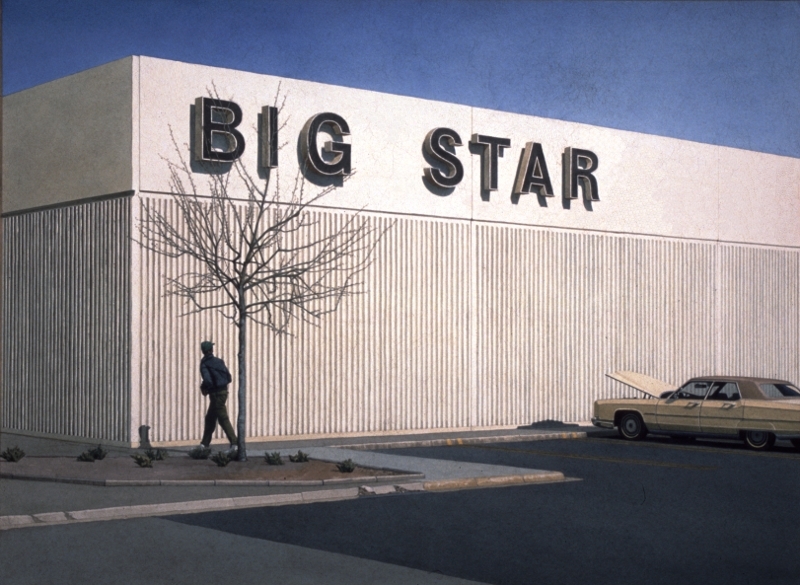
Big Star

Big Star - 28" x 21" - Watercolour
 
Sometimes the title for a painting is in the picture itself. At the time I painted this I was living in the USA. I was grocery shopping and had parked at the back of Big Star where there were always spaces. There was a big, old, broken down Ford and a dead tree against a concrete wall. I thought it would make a good painting. Not only a good painting but also somehow typical of my experience of living in the USA. I added the figure later. I didn't have a choice about the title, not when it was staring me in the face.
 

Wednesday, 26 October 2011

Seafront II, Two Deckchairs and a Blue Towel or I Should Keep Better Records


 Two Deckchairs and a Blue Towel - 10" x 7" - Watercolour

The trouble with bland, prosaic titles is that they are not memorable consequently there is a risk of using the same title twice. I knew an American artist, an exquisite painter, who kept a book of titles. If she thought, overheard or read a phrase that appealed to her she would write it down and use it when the right painting came along. I envied her for this. Her titles were poetic and almost as beautiful as the paintings. My titles are either simply for cataloguing purposes or perhaps to demystify the paintings or maybe to make them more mysterious, I am not sure which.

This painting was originally titled “Seafront II” until I realised that I had another painting with the same title which is coincidentally featured in an earlier post entitled "Some More Oars". I renamed it “Two Deckchairs and a Blue Towel” but I have this nagging doubt in the back of my mind that somewhere out there, there is another painting with that title too. I should keep better records.

Monday, 17 October 2011

What's In a Name or My Best Title Ever


111cm x 79cm - Acrylic on Canvas

My parents were very supportive about my decision to be an artist but my father often complained about the titles I give my paintings. “Too prosaic!” he would say. He once suggested that, had I painted it, I would have titled Edvard Munch's 'The Scream' - 'Seafront VII'. He had a point but I deliberately choose bland titles because I don't want to influence the viewer's reaction to the work. For example I rarely specify the geographical location and I resist emotionally charged words or descriptions. I prefer titles that are lists of some of the objects depicted in the painting or an unemotional description of an activity in the picture. Of course this in itself influences the viewer but a part of me hopes that the viewer will be so unimpressed by the title that they will forget it or pay it no heed while they look at the painting. If I was really confident I would just number the paintings. In fact the first big oil painting I did at art school is called 'One' which is coincidentally my second favourite title. However this is the outright winner even Dad approved of it. It is my best title ever – I called it 'Painting'.

Friday, 7 October 2011

Some More Oars

Seafront II - 7" x 12" - Acrylic on Paper
Here are the same oars as those in the previous painting. Everything else is different, even the type of chair, only the oars remain the same. There is a link here to the later Degas paintings of dancers. I always liked his use of space. I wanted to construct a couple of paintings where the design was more important than the subject. I don't think these are those but Degas is in there somewhere.

Saturday, 1 October 2011

Oars

Seafront I - 7" x 12" - Acrylic on Paper


I had just bought a pair of oars for our boat. It's an inflatable, old and patched, designed as a tender but we use it with an electric outboard to explore the local rivers and canal. The oars are for when the battery runs out. I liked them so much that I decided to paint them and this is the first of two paintings in which they are included.

Thursday, 22 September 2011

I Left My Hat In . . .

White Hats on the Sea Front - 16" x 12" - Acrylic on Canvas
 
I was taking photos on the seafront, not for this painting but as general source material for future paintings, when a friend sneaked up behind me and tipped the hat off my head. It was a lightweight, cotton cap which floated down onto the beach. A little later I climbed down to the sand to get it but, by the time I got there, it was gone. It was a cheap hat, it wasn't even very nice but it was useful and I missed it. I put it in this painting and here it will always be, on the beach. But the painting isn't really about my hat . . . or any hats for that matter.