Wednesday, 4 January 2012

Zut Alors!

Man on Steps - 10" x 14" - Watercolour

This was my father's favourite painting, another forerunner of “Looking Down Some Steps” ('Keep it Simple' - 12 December 2011), and painted at about the same time as the previous painting entitled “Steps” ('Sacre Bleu' – 27 December 2011). For my part I always wanted a raincoat like this (it was a Humphrey Bogart thing) and it reminded me of a dreadful pun in an old Bonzo Dog Do Dah Band song, 'Big Shot':

“Have you got a light, mack?”
“No, but I've got a dark brown overcoat!”

The steps were in Paris although I don't remember where. There are a lot of horizontal lines and the painting is divided into thirds, horizontally and vertically. In the preliminary drawings I experimented with the shadows following the diagonal, but it looked wrong so I changed it in the finished painting. The palette is very limited: earth colours, alizarin crimson and ultramarine. Most of the painting is done with layers of washes but the foreground steps use a wet into wet technique. I like the way the shadow changes colour and become less sharp as it moves away from the figure.

Tuesday, 27 December 2011

Sacré Bleu!

Steps - 10" x 14" - Watercolour on Paper

This is one of a series of pictures of people on steps and a forerunner of the painting 'Looking Down Some Steps' (see the blog entry 'Keep it Simple' - 12 December 2011). It was painted after a trip to Paris in the early 1980s. This was based on the steps leading up to the Basilique du Sacré Coeur in Paris. I accentuated the shadows and made the grassy slopes more geometric. I also divided the page exactly in half using the straight edge of the steps' wall and tried to pull the whole thing back together with colour and the diagonally placed pigeons and shadows.

Monday, 12 December 2011

Keep It Simple

Looking Down Some Steps - 20" x 30" - Acrylic on Canvas

 These steps are in Brighton, Sussex where I lived for several years in the 1970s but I painted them much later while I was living in Dorset. I had several photos of these (and other) steps which I was working from. I like this type of view, looking down on the subject from a position where the viewer is not quite standing on the ground. I became interested in shadows on steps when I was doing a series of paintings near the Sacré Coeur in Paris. When I remarked to a fellow artist that I had tried to keep things as simple as possible he looked at me as if I was mad, but it's true, in all my paintings I am trying to keep things simple.

Tuesday, 22 November 2011

I Never Painted K-Mart

Sleepy Time Inn - 28" x 20" - Watercolour 

Sometimes the title is in the painting, but hidden. The Sleepy Time Inn was a motel on the outskirts of Durham NC where you could rent a room for the afternoon. I stayed there once. By the time I painted it the new owners had changed its name to Travel Time Inn. I preferred its first name. The sign retains its original cloud shape and sleepy 'Z'. While I was photographing it from the 'Handy Andy' gas station / convenience store across the road I heard a tornado warning over the car radio hence the big black storm cloud. Ironically when a tornado finally came there was no advance warning. It destroyed K-Mart but left the Travel Time Inn untouched. Perhaps I should have painted K-Mart.
 

Thursday, 3 November 2011

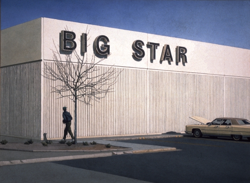
Big Star

Big Star - 28" x 21" - Watercolour
 
Sometimes the title for a painting is in the picture itself. At the time I painted this I was living in the USA. I was grocery shopping and had parked at the back of Big Star where there were always spaces. There was a big, old, broken down Ford and a dead tree against a concrete wall. I thought it would make a good painting. Not only a good painting but also somehow typical of my experience of living in the USA. I added the figure later. I didn't have a choice about the title, not when it was staring me in the face.
 

Wednesday, 26 October 2011

Seafront II, Two Deckchairs and a Blue Towel or I Should Keep Better Records


 Two Deckchairs and a Blue Towel - 10" x 7" - Watercolour

The trouble with bland, prosaic titles is that they are not memorable consequently there is a risk of using the same title twice. I knew an American artist, an exquisite painter, who kept a book of titles. If she thought, overheard or read a phrase that appealed to her she would write it down and use it when the right painting came along. I envied her for this. Her titles were poetic and almost as beautiful as the paintings. My titles are either simply for cataloguing purposes or perhaps to demystify the paintings or maybe to make them more mysterious, I am not sure which.

This painting was originally titled “Seafront II” until I realised that I had another painting with the same title which is coincidentally featured in an earlier post entitled "Some More Oars". I renamed it “Two Deckchairs and a Blue Towel” but I have this nagging doubt in the back of my mind that somewhere out there, there is another painting with that title too. I should keep better records.

Monday, 17 October 2011

What's In a Name or My Best Title Ever


111cm x 79cm - Acrylic on Canvas

My parents were very supportive about my decision to be an artist but my father often complained about the titles I give my paintings. “Too prosaic!” he would say. He once suggested that, had I painted it, I would have titled Edvard Munch's 'The Scream' - 'Seafront VII'. He had a point but I deliberately choose bland titles because I don't want to influence the viewer's reaction to the work. For example I rarely specify the geographical location and I resist emotionally charged words or descriptions. I prefer titles that are lists of some of the objects depicted in the painting or an unemotional description of an activity in the picture. Of course this in itself influences the viewer but a part of me hopes that the viewer will be so unimpressed by the title that they will forget it or pay it no heed while they look at the painting. If I was really confident I would just number the paintings. In fact the first big oil painting I did at art school is called 'One' which is coincidentally my second favourite title. However this is the outright winner even Dad approved of it. It is my best title ever – I called it 'Painting'.